How to Combine Fonts
Blog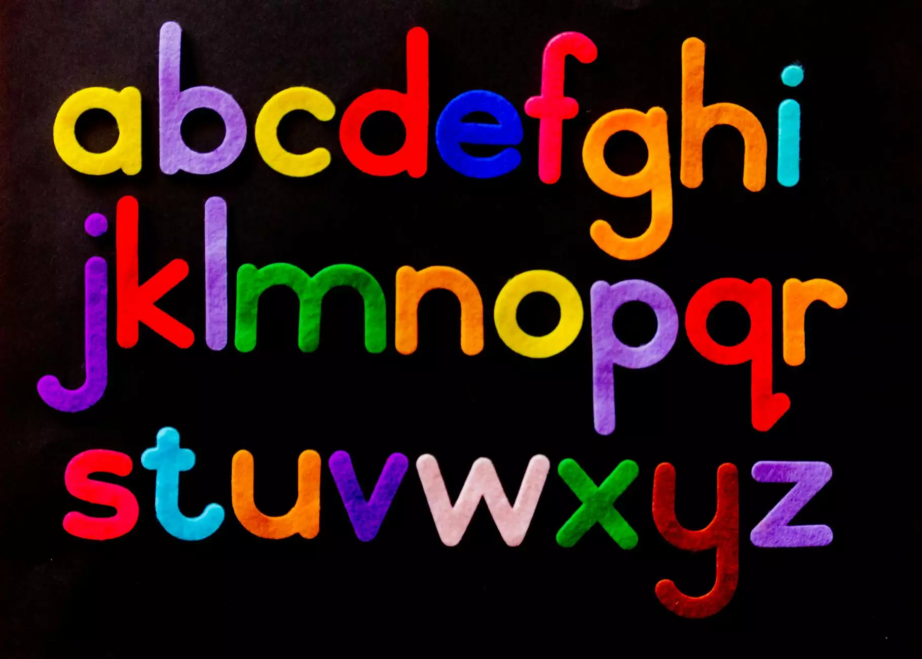
Choosing the right combination of fonts is crucial for creating an aesthetically pleasing and readable website. At I Maintain Sites, we understand the importance of selecting fonts that suit your brand and content. In this comprehensive guide, we will share valuable insights and tips on how to effectively combine fonts to enhance the visual appeal and overall user experience.
The Importance of Font Combination
When it comes to web design, fonts play a vital role in conveying your brand identity, establishing hierarchy, and guiding your users' reading experience. Your font choice should align with your business and consumer services in website development. Combining fonts thoughtfully can significantly impact the perception and engagement of your website.
Consider Brand Personality and Target Audience
Before diving into font combinations, it's crucial to define your brand's personality and understand your target audience. Are you a modern and innovative website development company? Or a classic and sophisticated business serving a specific niche? Identifying these aspects will help you select fonts that resonate with your brand's essence, attracting the right audience.
For a modern and innovative brand, you may consider combining geometric sans-serif fonts like Roboto and Montserrat. On the other hand, a classic and sophisticated brand could benefit from pairing serif fonts like Playfair Display or Merriweather with an elegant script font like Great Vibes.
Create Contrast and Hierarchy
Combining fonts with contrasting styles can establish visual hierarchy and guide users through your website's content. Using varying font weights, sizes, and styles is an effective way to differentiate between headings, subheadings, and body text.
Let's say you want to highlight important headings within your consumer services sections. One effective approach would be to pair a bold and attention-grabbing font like Oswald with a more subtle and readable font like Lato for the body text. This contrast in styles creates visual interest and improves overall readability.
Avoid Font Overload
While font combinations are essential, it's crucial to strike a balance to maintain a harmonious design. Using too many fonts can clutter your website and distract users from the main content. Aim for simplicity and consistency.
As a rule of thumb, limit yourself to two or three fonts per website. This allows for a cohesive and unified appearance while still offering enough versatility for different content types.
Test and Iterate
Once you have selected font combinations for your website, it's important to test them in different contexts. Consider using a typography tool like Google Fonts or a design software that allows you to experiment and visualize how the chosen fonts work together.
Remember, fonts may behave differently on various browsers and devices. Test your website on multiple platforms and screen sizes to ensure a consistent and visually appealing experience for all users.
Conclusion
Combining fonts is an art, and at I Maintain Sites, we excel in creating captivating and user-friendly websites through effective font combinations. By considering your brand personality, target audience, creating contrast and hierarchy, avoiding font overload, and testing your choices, you can achieve an outstanding visual impact that elevates your website's overall appeal, professionalism, and engagement.
Ready to take your website's design to the next level? Contact I Maintain Sites, the leading business and consumer services website development company, and let our team of experts create a visually stunning and optimized online presence for your brand!


